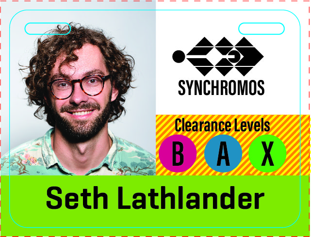
I work with a lot of badges in my current position. I’ve seen a lot of things that work and don’t work through the 19 years that I have worked at pcnametag. This is an example of a mock up for someone. There are issues here that I want to call out just because I see them as I create this post. The id picture should be reduced so that it isn’t getting affected by the slotting. The Synchromos logo (I created that as a mock up logo) should be lowered so that there is at least a decent 1/8″ buffer between the slotting and the edge of the logo. Allowing free space is important so that nothing critical will be trimmed out when the slotting occurs. Also, depending on the tolerances of the machine doing the die cutting, allow for at least 3/16″ space around the edge of the badge so nothing critical is cut when the badge is being produced.

